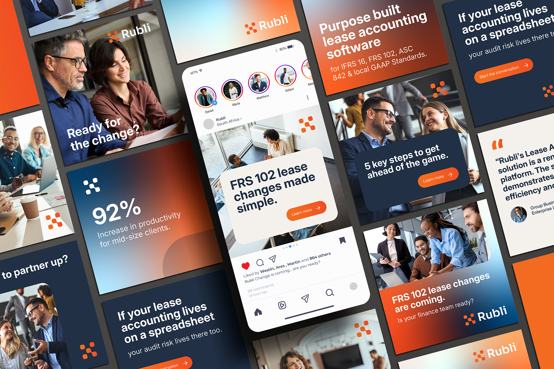
Rubli is a lease accounting SaaS platform that helps organisations navigate the complexities of lease management, reporting and compliance. As the platform matured, its visual identity no longer reflected the quality, sophistication and confidence of the product itself, creating an opportunity to reposition the brand for its next stage of growth.
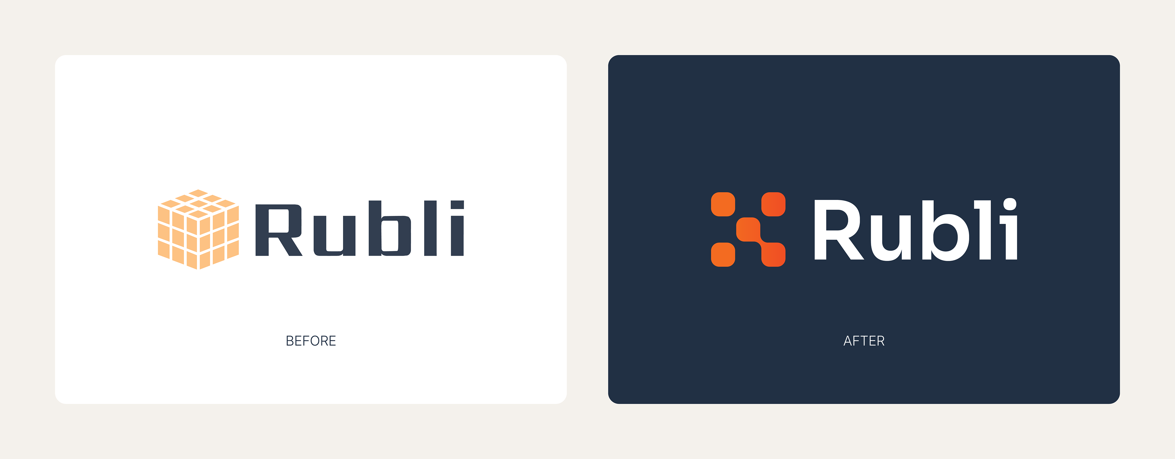
The challenge was to modernise the brand without losing the equity it had already built. While the existing identity featured a cube-inspired device, its connection to the platform's offering had become increasingly unclear over time. Rather than undertaking a complete rebrand, the approach focused on evolving the identity, retaining recognisable brand assets while creating a more strategic and purposeful visual system.
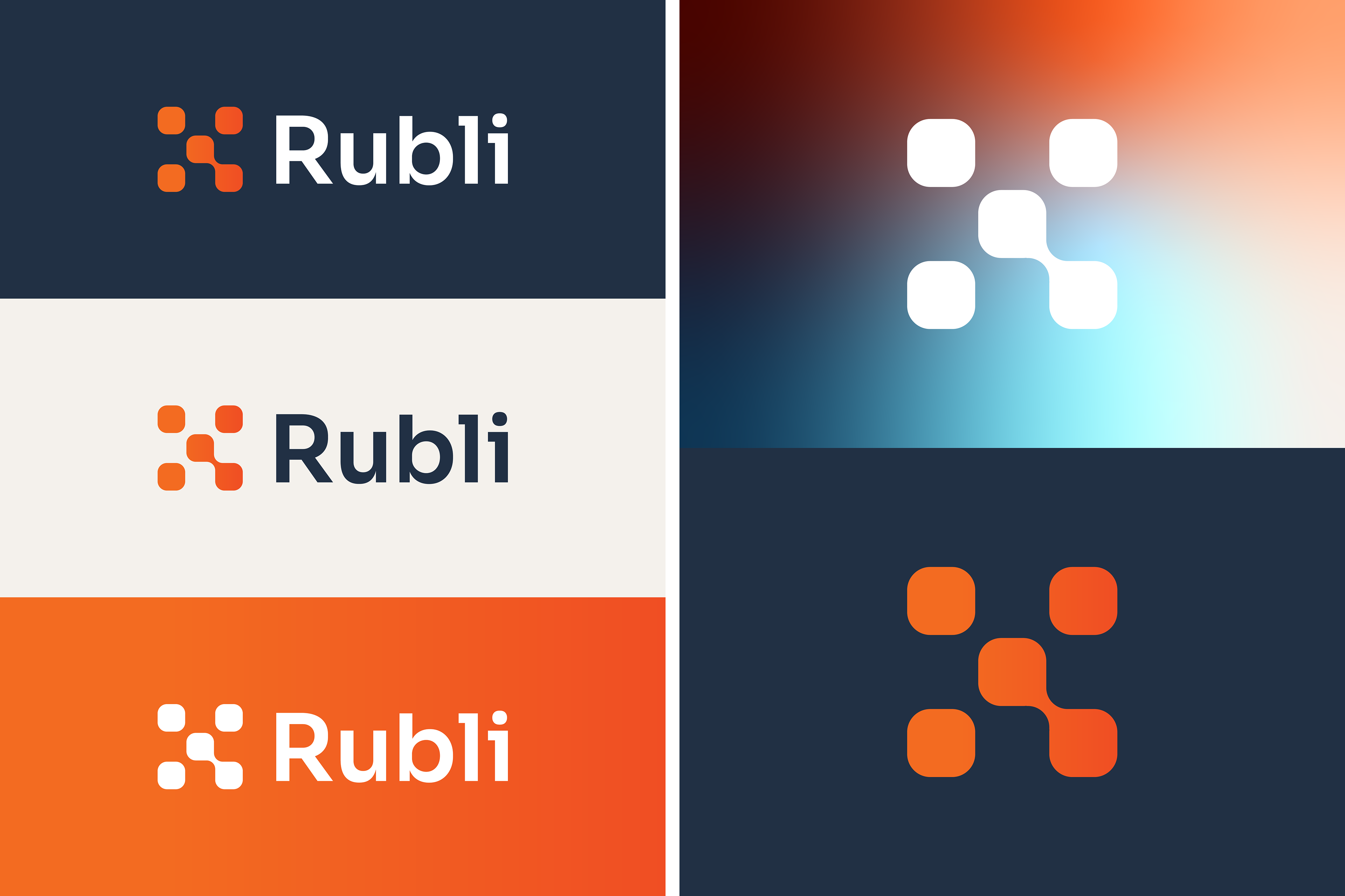
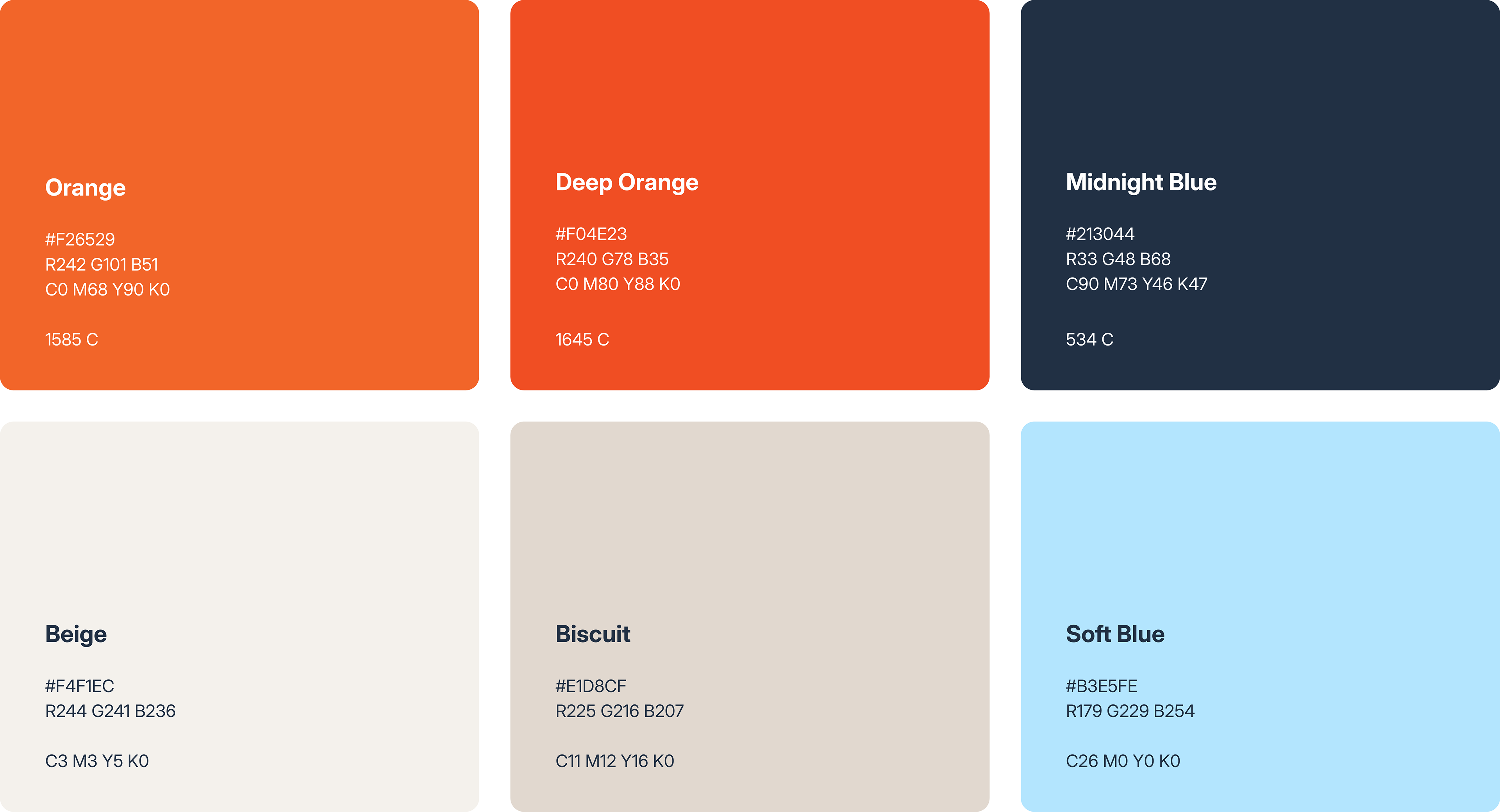
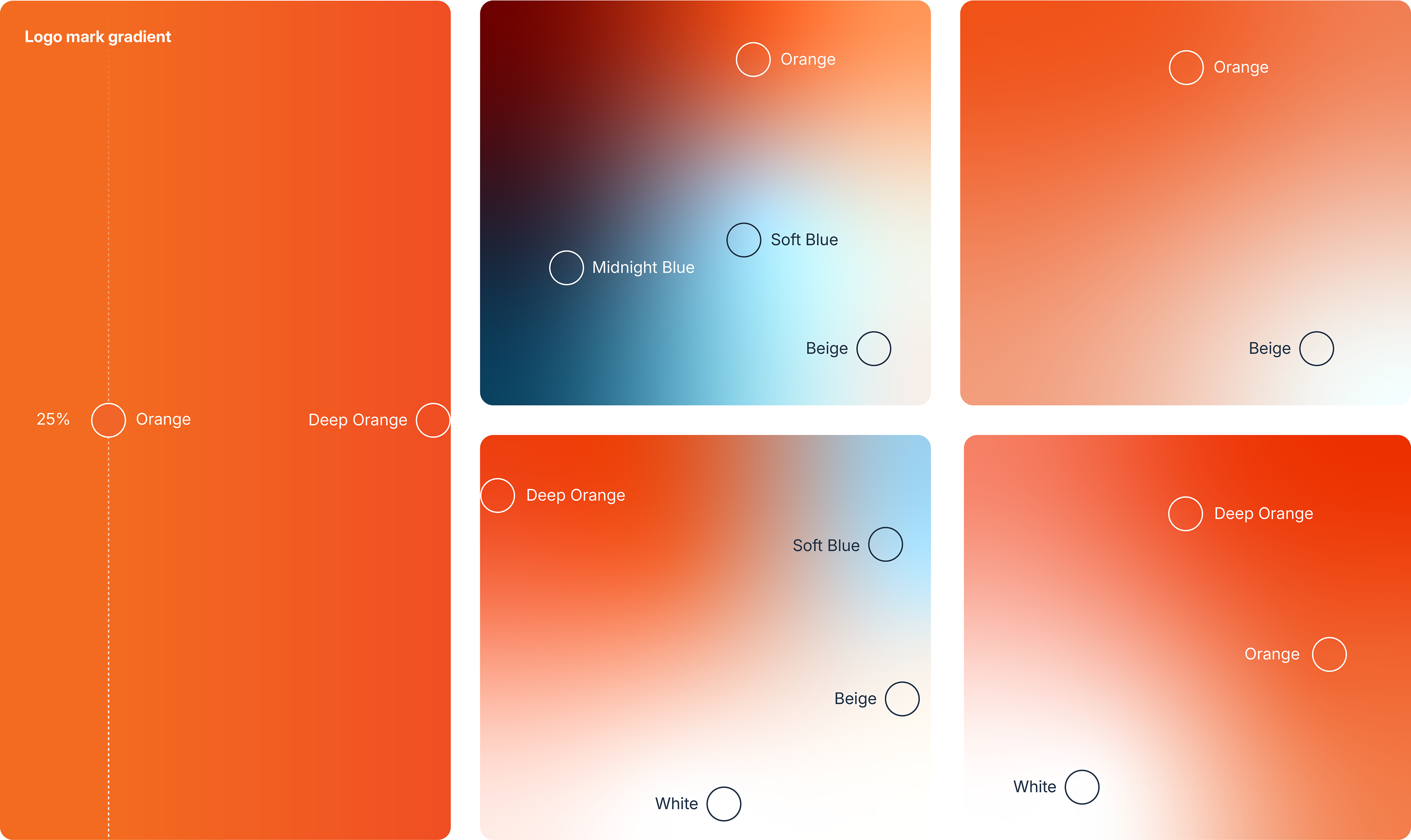
A key consideration was preserving Rubli's distinctive orange colour palette, which had become an important part of its recognition. The palette was refined and expanded through the introduction of gradients and supporting colours, creating a more contemporary and flexible system suited to modern digital applications. This allowed the brand to maintain familiarity while feeling significantly more current and dynamic.
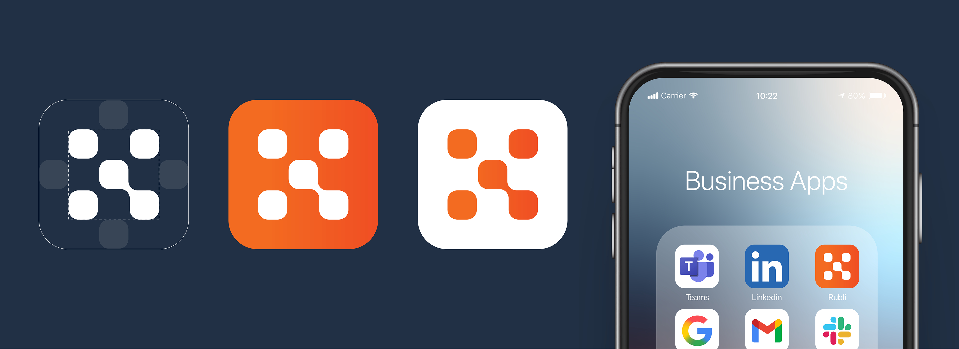
The refreshed identity was designed to balance technical expertise with accessibility. Lease accounting is a highly specialised field, yet Rubli's value lies in making complex processes simpler and more manageable. The visual language therefore combines clarity, structure and precision with a warmer, more human approach, helping the brand communicate both credibility and ease of use.
Beyond the logo and colour palette, the project established a broader visual framework to support the platform's continued growth. New graphic elements, application principles and brand assets were developed to create consistency across product, marketing and communications touch points.